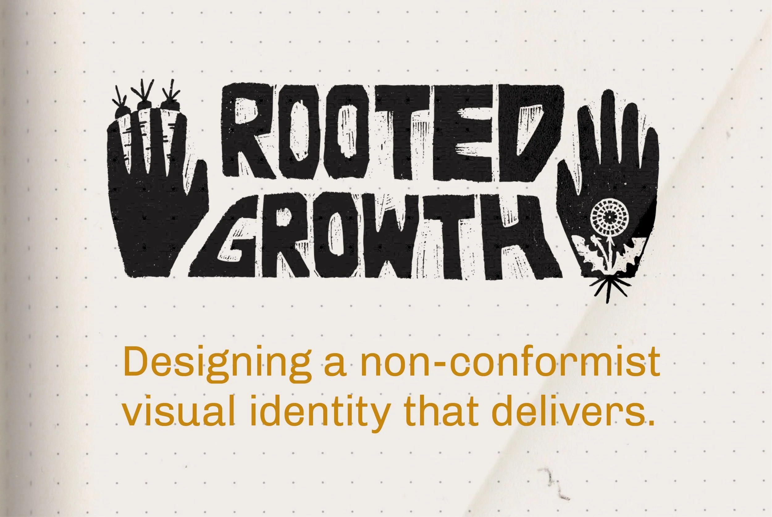
Rooted Growth: Designing a non conformist visual identity that delivers
A glimpse into the process for creating a visual identity that breaks the rules while delivering strategy.

When Rooted Growth Community Center for Healing opened its doors in Brooklyn, it wasn’t trying to blend in. The center was built around a radical idea: healing is community work. With arts‑ and community‑focused programming at its core, Rooted Growth needed a visual identity that reflected its values while standing apart from the sea of wellness brands and community centers surrounding it.
From the beginning, the challenge was clear. There are countless yoga studios, counseling spaces, and wellness centers across the five boroughs. And to make things even trickier, “Rooted Growth” is a surprisingly common name. A quick search revealed dozens of similarly named organizations, many of them using the same colors, symbols, and visual tropes. Differentiation was essential.
The process began, as always, with alignment. Before I even started sketching, we scheduled a Discovery & Clarity Call. The client talked, and I listened. Together, we clarified the heartbeat of the brand: its purpose, vision, and mission, as well as the attitude, values, and audience.
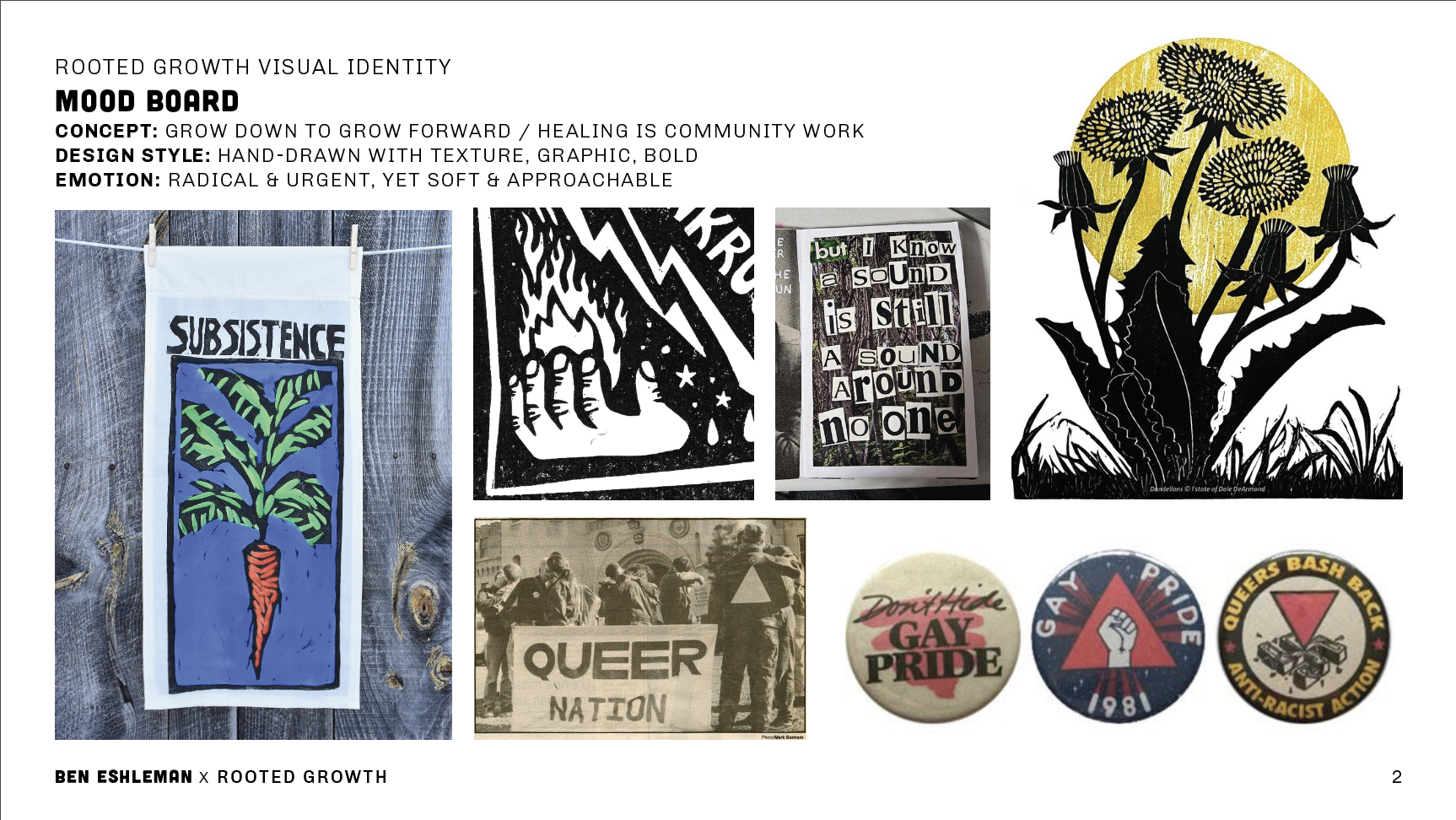
When I got to work, I pulled inspiration from sources rooted in collective creation and resistance, like Bread + Puppet Press, 80s and 90s queer activism, handmade protest graphics, zines, and community signage. I didn’t use these references as a way to copy other work, but as a way to cultivate meaning. The references shared a DIY spirit that was intentional, expressive, and deeply human. Exactly what Rooted Growth needed to feel radical and yet approachable.
Symbolism played a quiet but powerful role in shaping the identity. Elements like hands, root vegetables, dandelions, and simple geometric forms reflected collective care, growth, and healing as something we do together. Every visual choice was made with intention, so the identity could connect authentically with the people it was meant to serve.
The final system breaks a few traditional branding “rules,” and that’s exactly why it works. From business cards made from linocut stamps to a storefront painted by an amateur (me), the identity embraces imperfection, labor, and human hands. The process wasn’t always comfortable (including when I literally had to work from the top of the ladder), but that discomfort is part of the work.
Rooted Growth is proof that when branding is rooted in values, community, and care, it can be both expressive and strategic. Designing this identity wasn’t just about standing out. It was about showing up honestly, and creating something that truly belongs to the people it serves.
If you’re building something rooted in values, community, or care—and you’re wondering how to translate that into a visual identity that actually feels like you—I’d love to talk. Whether you’re at the very beginning or somewhere in the messy middle, thoughtful design can help clarify your message and bring people together around what matters most. Feel free to reach out, follow along, or simply take what resonates and apply it to your own work.

My spouse called me a reverse mullet
Party in the front, business in the back?
Last week, my spouse called me a reverse mullet.
At first I thought it was a ridiculous accusation, but I’ve had a bit of time to reflect and he’s actually got a point.
You know how the standard mullet is business in the front & party in the back? Maybe I’m the opposite.
I’ve had the “Party in the front” look for a long time. When I first started freelancing, I worked as few hours as I could get away with, acted pretty casual with clients, and kind of just waited for new opportunities to fall into my lap.
And like a party, it started out fun, but after five years, it kind of lost its charm.
So I’ve been working on the “Business in the back.” I’ve been figuring out my brand values, my financial goals, and my client strategy. Some days I feel like I should trade in my black band tees for a pinstripe oxford shirt.
(But don’t worry; I’m not actually going to do that)
I’m still leading with the party. I want clients to see me as fun, imperfect, and a little bit rebellious. But I also want to show up professionally. I want to do both: be confident and be authentic to my true self.
So yeah, I’m rocking the reverse mullet. Metaphorically.
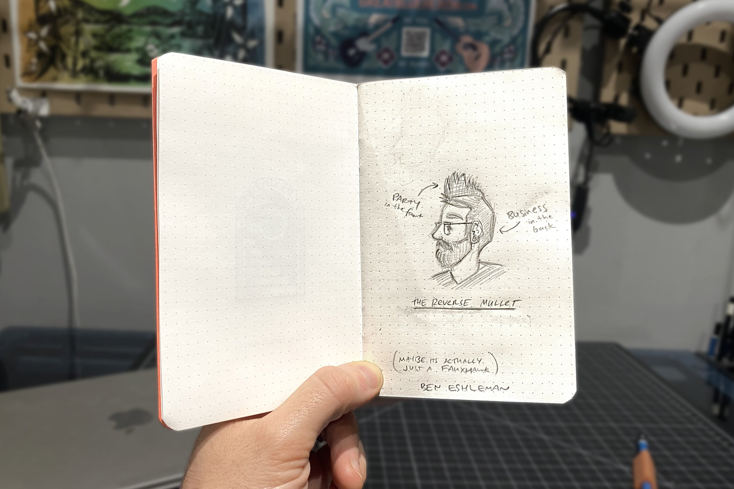
(Upon doodling this reverse mullet, I realized maybe it's just a fauxhawk. Which I definitely rocked for way too long)
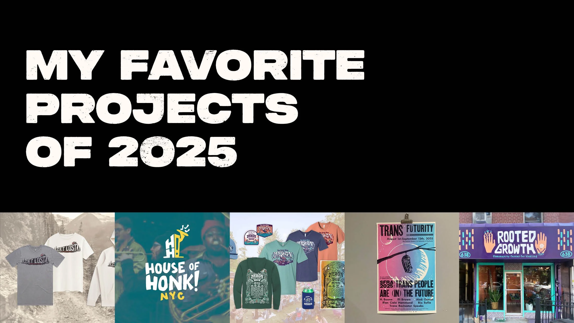
My favorite projects of 2025
2025 was a big year for me & my business! Here’s a recap of my favorite projects of the year.
2025 was a big year for me & my business! I worked on a record number of projects, and as we kick off the new year, I wanted to highlight some of my favorites.
These are truly in no particular order. All just work I’m excited to share.
Shout out to my clients and collaborators who made last year spectacular. I’m looking forward to more fun in 2026!
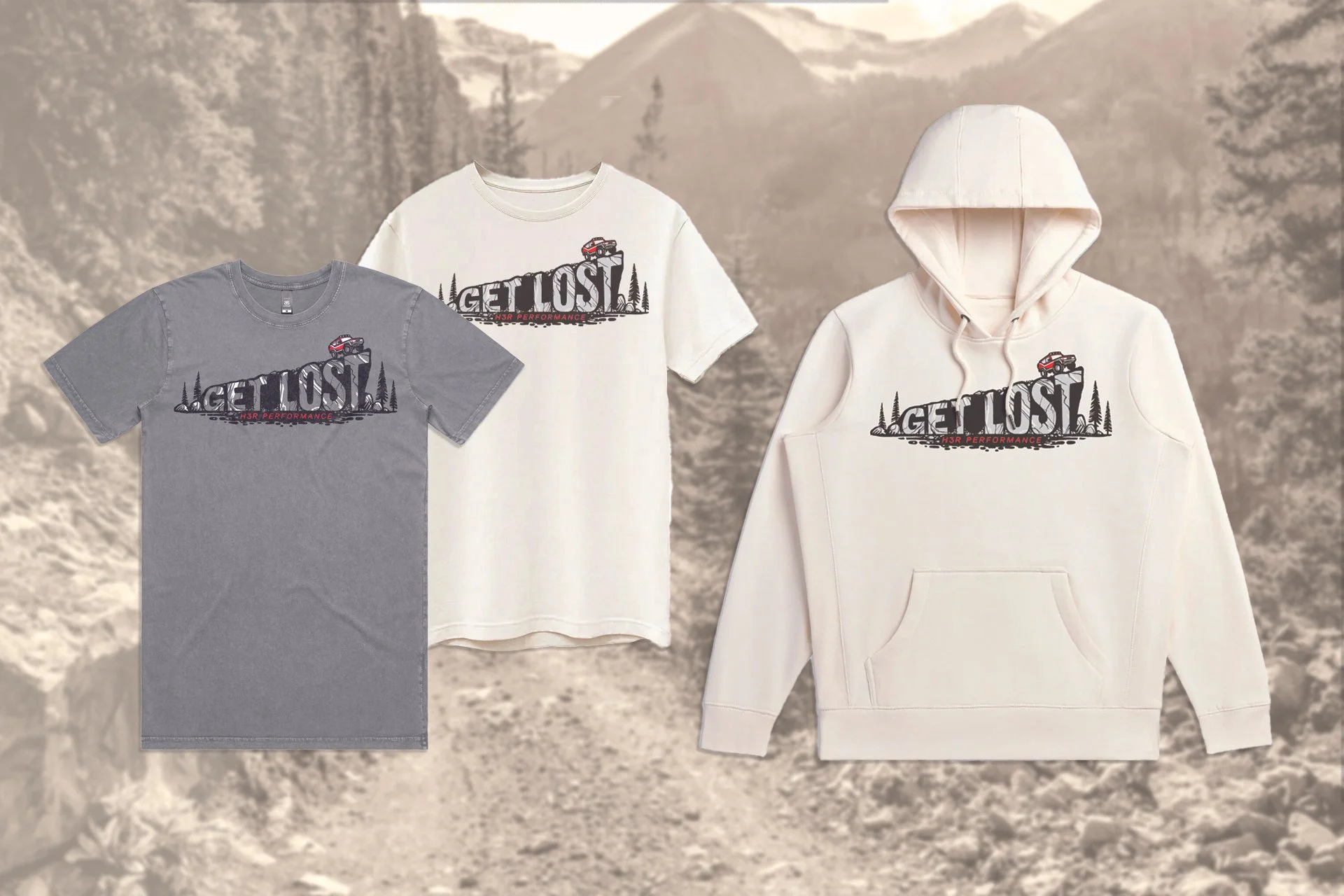
H3R Performance Merch
OVERVIEW
In early 2025, H3R Performance, an automotive accessory brand, sought my help to design merch that helped increase brand loyalty and specifically targeted their overland customers—rugged automotive enthusiasts who were drawn to the freedom of off-road exploration.
PROCESS
I came up with three different design concepts, and with the client’s feedback, developed designs to use across a collection of two t-shirt variations and a hoodie. With the help of my production partner, we selected garments that were high quality and made in the USA with sustainable fabrics.
RESULTS
Unfortunately, due to economic uncertainty in the first half of 2025, this project never made it to production. But I’m thrilled with the designs I developed, the garments we selected, and the partnerships I solidified with both the client and the production partner.
WHY IT’S MY FAVORITE
As someone who loves adventuring and camping in the back of my Subaru, I’ve always fantasized about becoming an overlander, like the target audience. So it was fulfilling to imagine going down that trail myself.
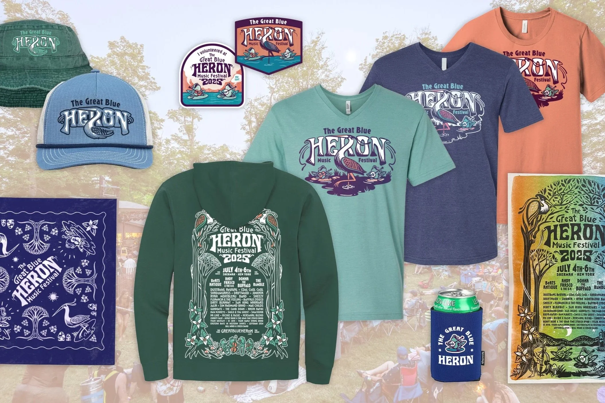
The Great Blue Heron Music Festival Merch
OVERVIEW
The Great Blue Heron Music Festival asked me to design their merch collection for the third year in a row. This year, the festival organizers sought to increase profitability to help pay for major infrastructure projects. So in addition to design & illustration, the organizers requested my help with strategy, merchandising, and production coordination.
PROCESS
Really, this process starts at the beginning of the year, when we design the poster & marketing collateral. The promo sets the tone for the festival, and the merchandise follows suit. Once promo is finalized, I translate that design across a collection of merchandise. Each piece of merchandise—t-shirts, hoodies, stickers, koozies, and more—needs to be a stellar item on its own, while also fitting in with the collection as a whole. It’s a delicate balance, and one I’m getting better at every year.
RESULTS
By developing a merchandising strategy and analyzing previous years sales, I helped the Great Blue Heron grow their return on investment from 11% in 2024 to 66% in 2025.
WHY IT’S MY FAVORITE
There’s nothing as rewarding as working for this festival. After the months stressing over compositions and production specs and ship-by dates, I close my laptop and head up to the festival for a long weekend. It’s the best way to celebrate a job well done—dancing and camping and vibing in the sunshine. And I get to see how stoked festival goers are about the merch, and it’s just awesome.
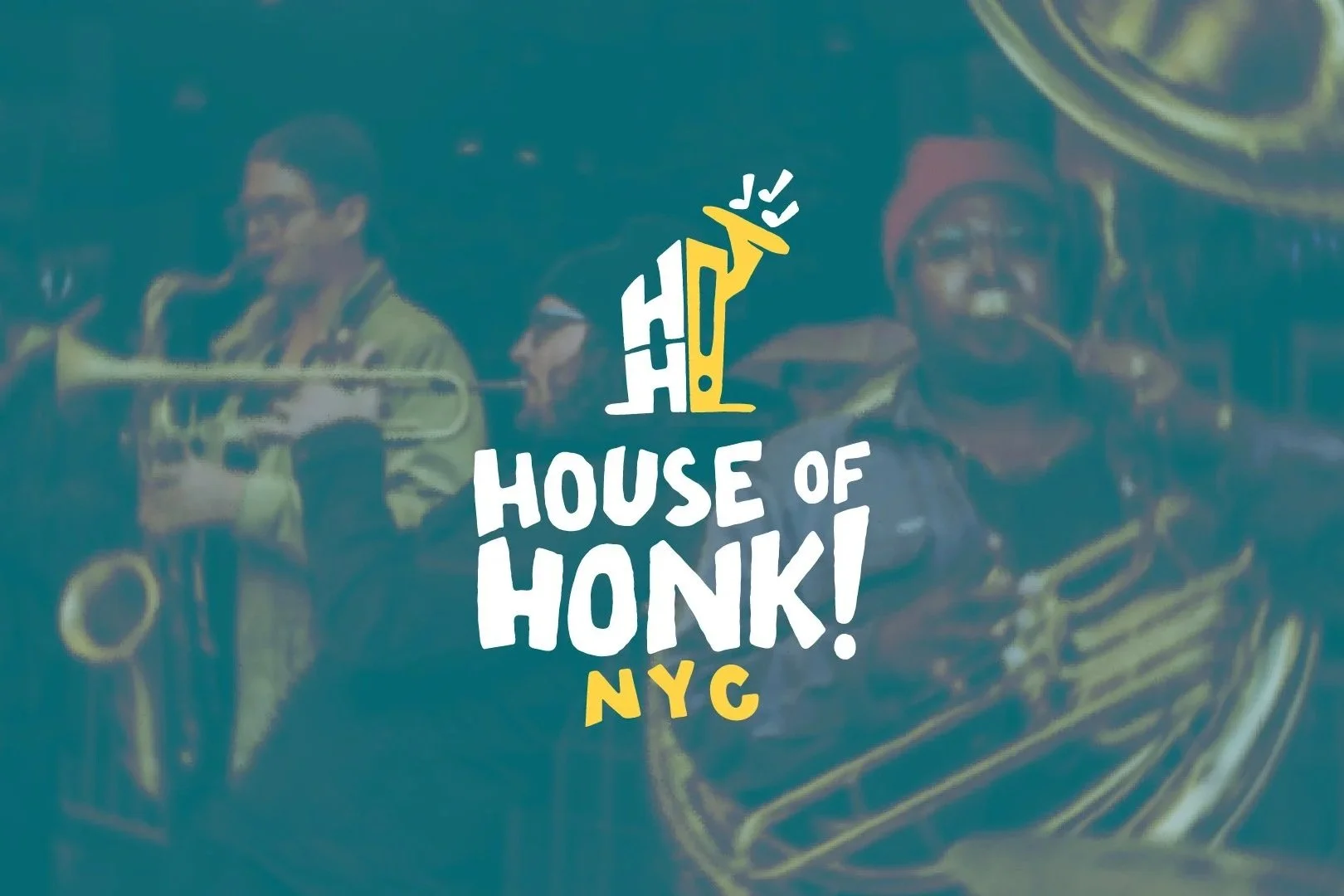
House of Honk! Logo System
OVERVIEW
After working together on the poster for Honk NYC! Festival, the organizers asked for my help finalizing a logo for their new non-profit, House of Honk! The organizers had worked with a few other designers to develop a logo, but it wasn’t quite working. So I jumped in!
PROCESS
At first the project seemed simple—the client had a rough logo that another designer had developed, and they just wanted me to make a few adjustments. Easy, right?
But when I started digging in, I saw opportunity to take their concept and make a logo system that better represented their mission and was more adaptable.
I developed a visual system of logos and colors that could be used across platforms and use cases, and I packaged everything up nicely with logo usage guidelines.
RESULTS
The client has a new visual identity which can immediately be applied across social media, letterheads, fundraising campaigns, and more.
WHY IT’S MY FAVORITE
This project had a really clear A-Ha Moment for me. The logo concept was a house, a visual representation of the home for street bands & merrymakers across NYC. I was sketching some different houses to consider, when suddenly it hit me: houses don’t look like that in New York City. It was a simple thought that became huge revelation and completely changed the trajectory of the project. From there, the rest of the logo system fell right into place.
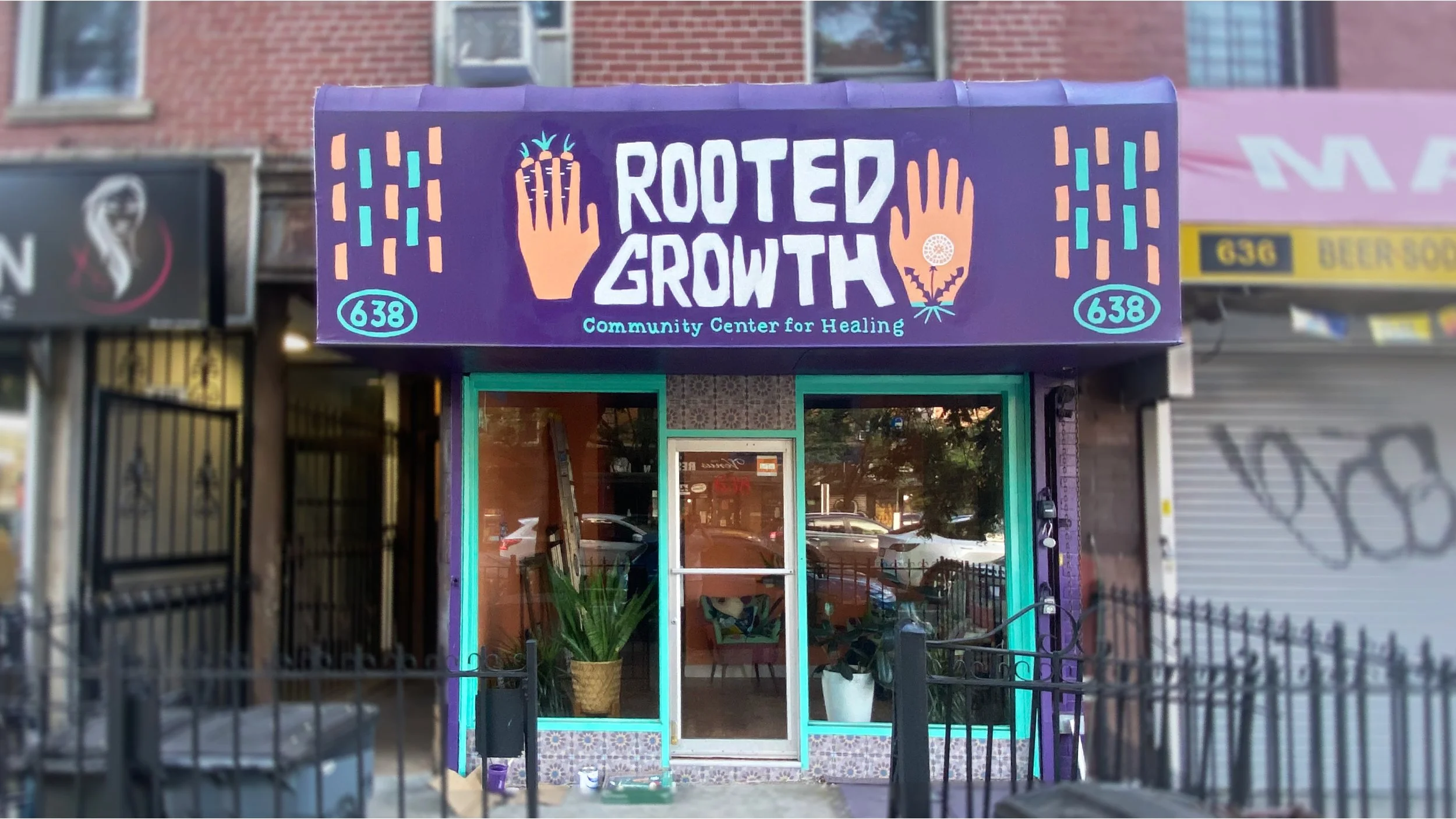
Rooted Growth Branding
OVERVIEW
The founding members of a healing collective planned to open a community center in Brooklyn. The center would broaden the idea of what healing looks like through arts- and community-focused programming.
The organizers wanted this brand to be unlike any other business or community space in the neighborhood, or perhaps in the whole city. The vision was radical & urgent to meet the needs of the community, yet soft & approachable to create a healing environment. And because the space centered people and art, the entire brand was designed & delivered by hand.
PROCESS
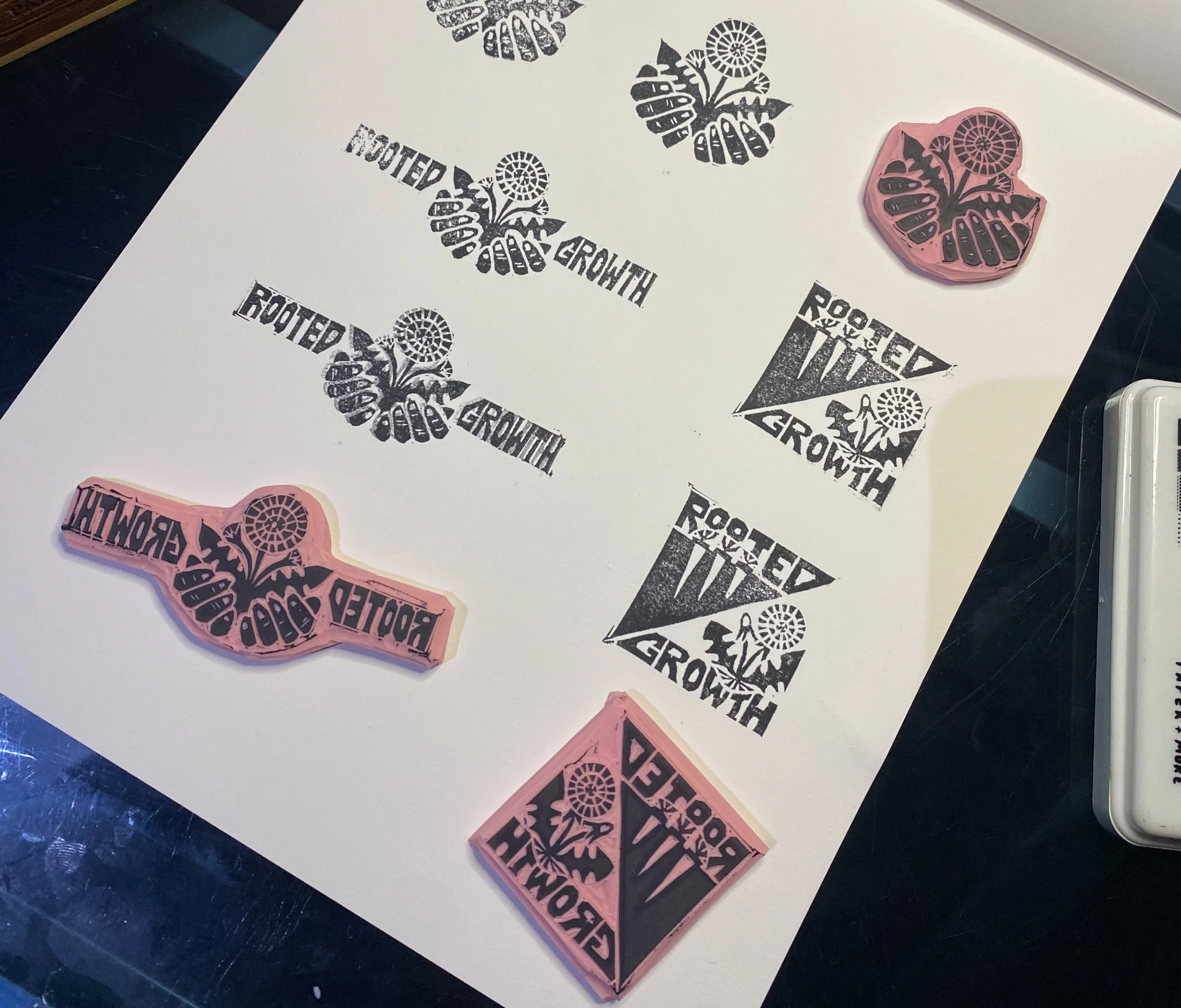
I created a system of logos which were designed to be easily reproduced by any artist in any medium. The deliverables included hand-carved stamps for each logo. I also painted the primary logo on the storefront and additional elements in the space by hand.
RESULTS
With a bright and unmistakable storefront, Rooted Growth’s visual identity has increased awareness of the space. The excitement in the neighborhood has helped support the collective’s mission of creating a holistic space for healing.
WHY IT’S MY FAVORITE
This project was an incredible opportunity to use my hands. Throughout the process, I blended digital and analog design processes. I also got to paint a storefront, which I was kind of a bucket list item (even though I’m afraid of heights and never want to work on a ladder again). This project was—and continues to be—a joyful collaboration.
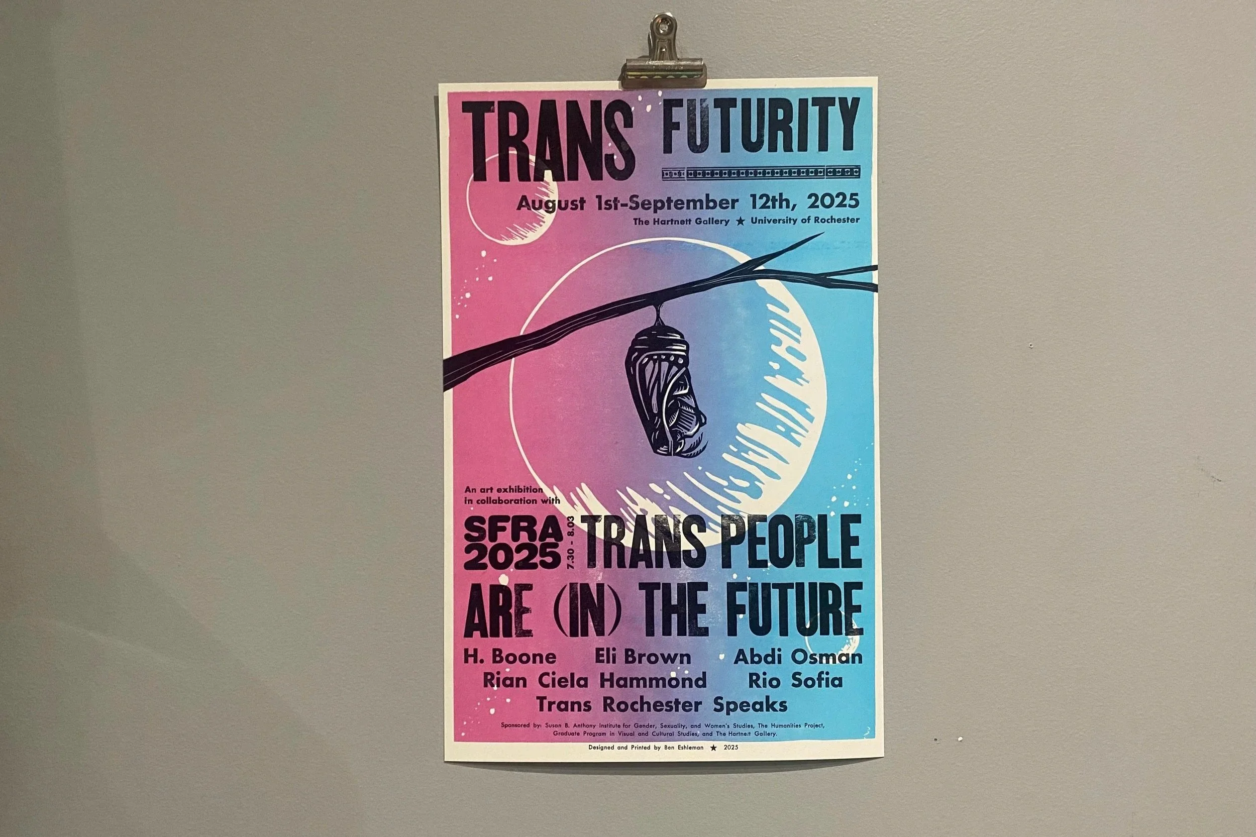
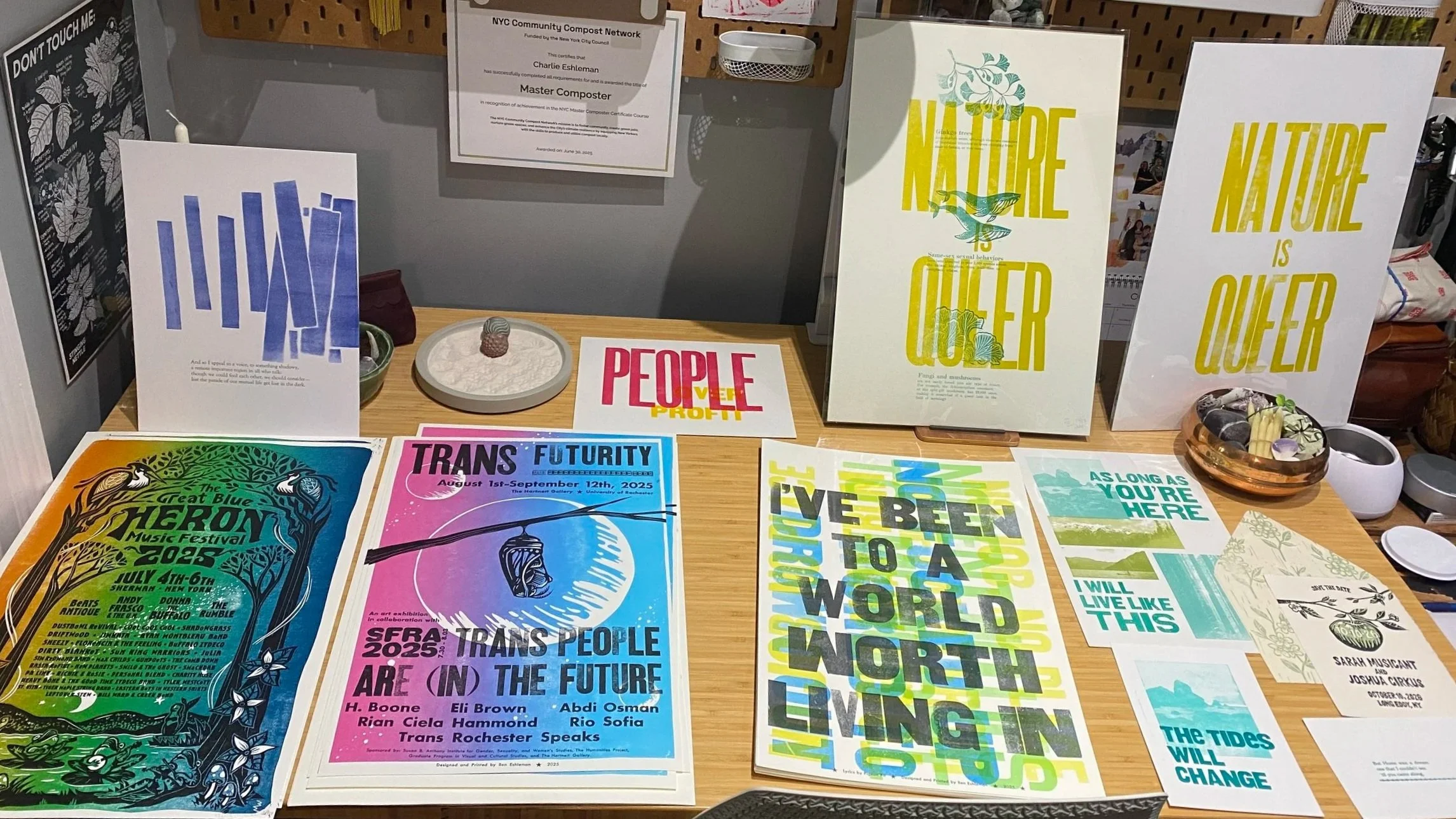
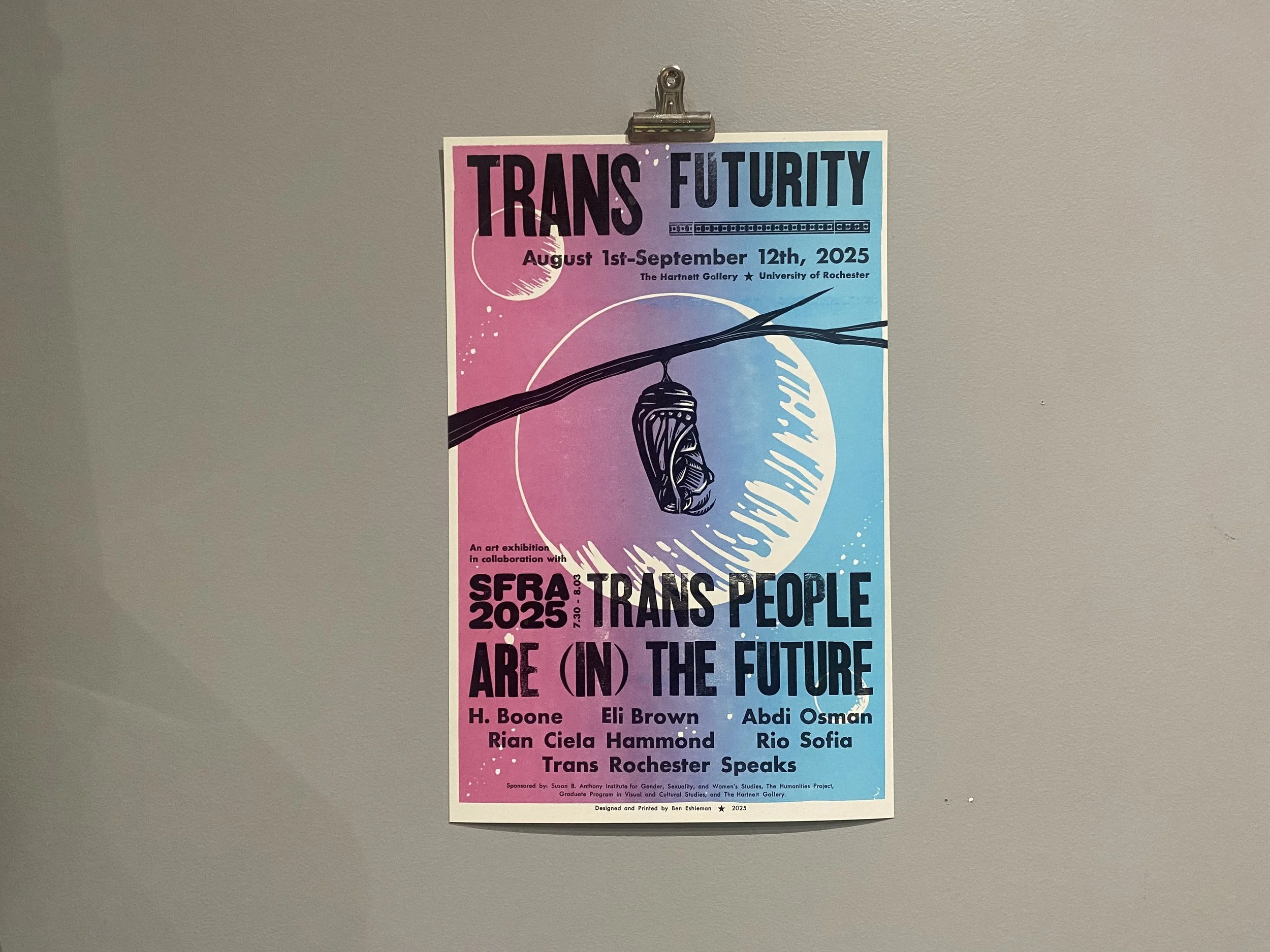
SFRA x Trans Futurity Posters
OVERVIEW
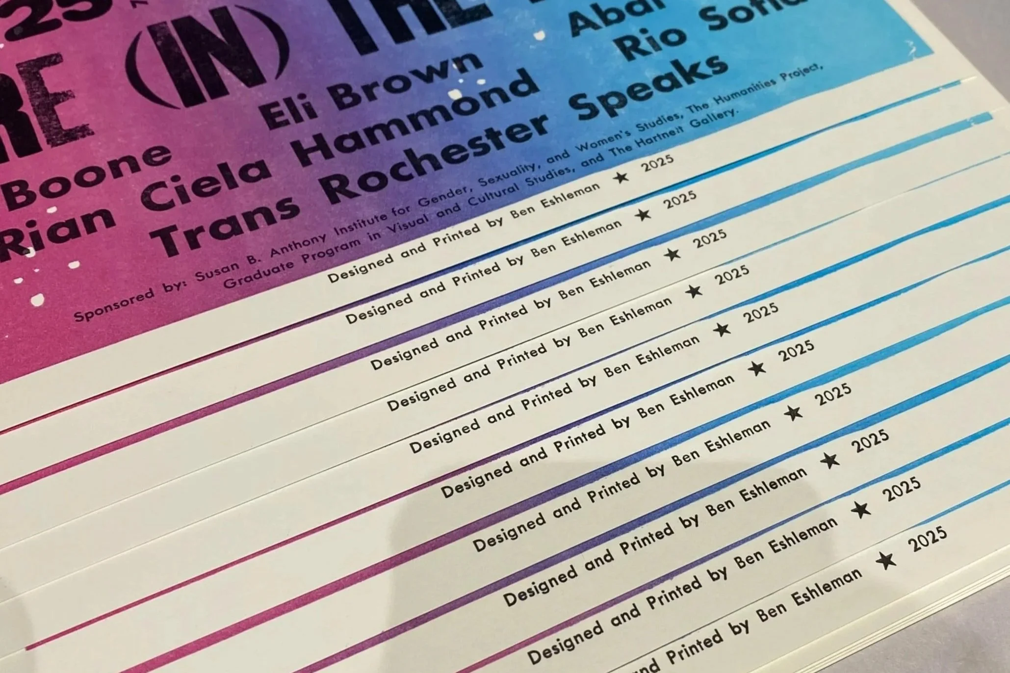
Some folks at the University of Rochester asked me to design original artwork relating to the Science Fiction Research Association’s annual conference and its theme: Trans People Are (In) The Future. The conference also aligned with an art exhibition on campus titled Trans Futurity.
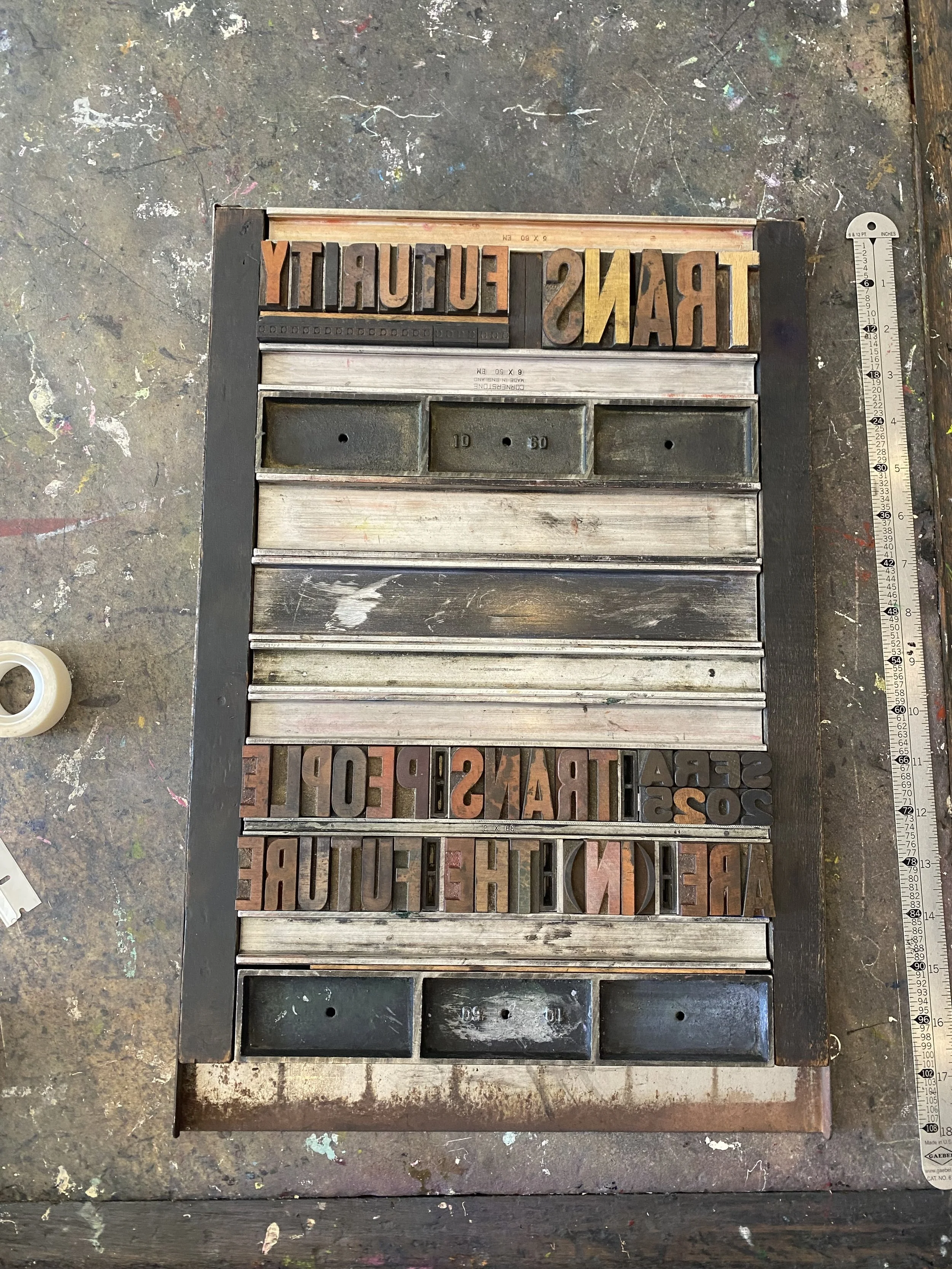
The client asked for 150 letterpress printed posters, specifically requesting to use antique wood type and hand-carved linocut blocks. They also requested a design for tote bags for conference attendees that complimented the posters.
PROCESS
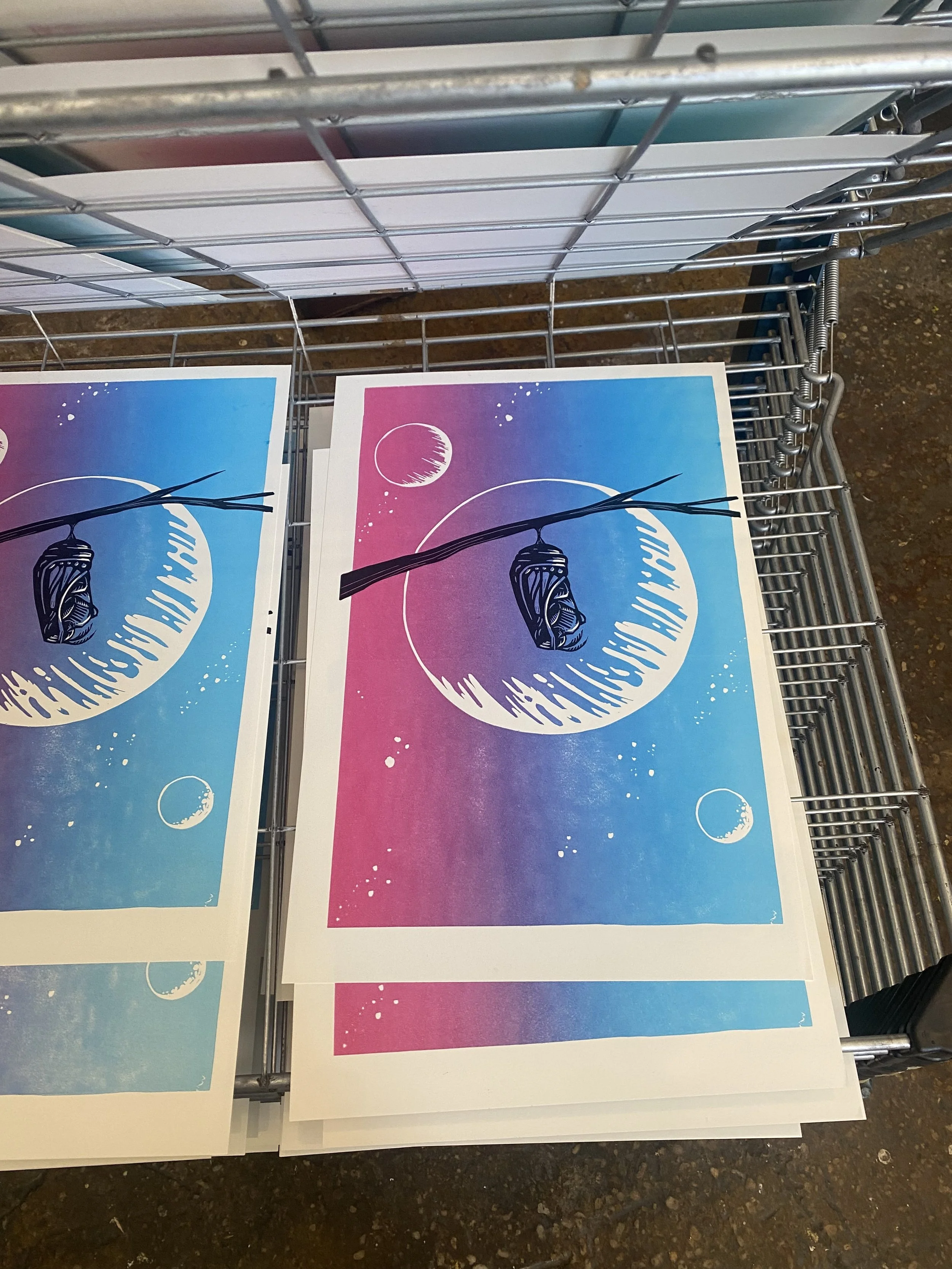
I sketched up some concepts, set & proofed the antique type, carved the block, and printed 150 posters layer by layer. These are limited edition reduction lino-block posters, hand carved and letterpress printed on Vandercook proofing presses alongside antique wood and metal type. The printing was done in two different community studios in New York City.
RESULTS
To my absolute dismay, most of the original posters got lost in transit to the client. The few remaining original posters were given to keynote speakers of the conference, and thanks to the client’s quick thinking, we provided digitally printed posters for conference attendees. The original posters eventually made it to the client, albeit long after the conference wrapped up. Definitely not ideal, but still better than nothing!
WHY IT’S MY FAVORITE
This project brought together a bunch of my interests—sci-fi, trans theory, letterpress printing, and University of Rochester (where I attended my freshman year of college). It was a joy to collaborate with people I used to share community with, print a bunch of posters with my hands, and then attend a sci-fi conference!
Got a project for 2026?
I'm only doing one holiday market this year
And honestly, I’m so stoked about it.
And honestly, I’m so stoked about it.
I’ve been feeling really burnt out on printmaking lately.
Well, not all printmaking, but definitely the stuff I’ve been doing for the past few years. You know, the cute little linocut prints with a nice phrase or a growth metaphor. Yeah, I’m kind of over those.
A couple weeks ago, I sat down to restock my prints. I made a list, pulled out the old blocks, set up my press, and then I just had an overwhelming sense of UGH. I realized how much I hated the idea of printing the same blocks again and again and again.
So instead of printing the same old stuff, I pulled out all the new prints I’ve made this year. I took a step back to admire them and just... sighed with relief.
Because I’ve been learning something new.
This is the year I’ve learned letterpress. And part of learning something new is experimenting, testing boundaries, slamming up against guard rails of what is possible.
And it has been SO FUN.
The only downside is that I don’t have many prints that feel market ready.
This whole year, I’ve been making art that’s just for me. It’s not for markets, or for social media, or for an audience. I’m just making whatever comes to mind. Kind of like what I did with linocut prints four years ago (and some of those prints STILL have never sold).
Oh yeah, and I’ve been making stuff for clients. Like so much client work. And that has been really challenging and exciting and rewarding in a whole different way.
So as we head into the holiday season, I’m glad to know that this year has been one of growth and evolution. I’m ending the year with new skills, a ton of new experiences, and more confidence than ever as a printmaker.
I’m just not going to be showing those things off at every holiday market I possibly can this year.
So anyway, the one holiday market will be at the Center for Book Arts on Friday December 5th. Come see the new stuff I’ve been making (and some old stuff) in the studio where I’ve been making most of it. Click below for more info and to RSVP.
Learning to let go
How my dream project got lost in the mail.
A few months ago, I got a project inquiry that seemed too good to be true. Some folks at the University of Rochester reached out and asked me to create letterpress printed posters for a trans-themed science fiction conference.
Initially, I thought it was spam. I thought someone collected my data and asked AI to write the perfect project brief all so they could dupe me into giving them my credit card info or something.
But I took the call, and it was all real. My dream project.
The client asked me to design original artwork relating to the conference and its trans futurity theme. They asked for 150 letterpress printed posters, specifically requesting to use antique wood type and hand-carved linocut blocks. I was so stoked.
So I did the work, sketching up some concepts, setting & proofing type, carving the block, and printing, printing, printing.


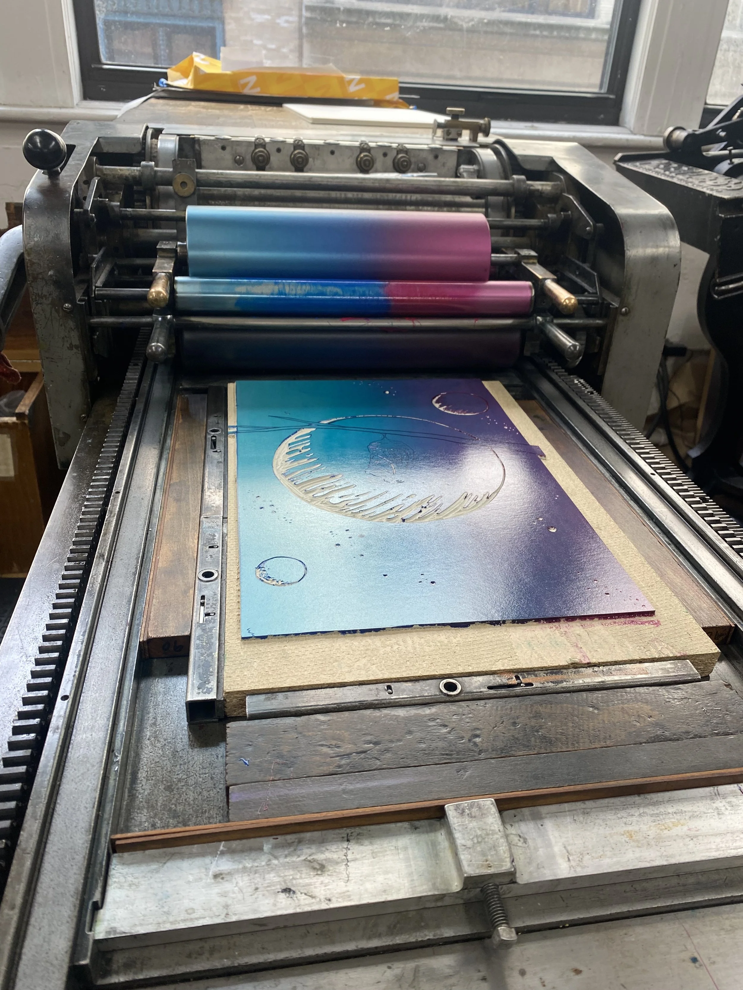
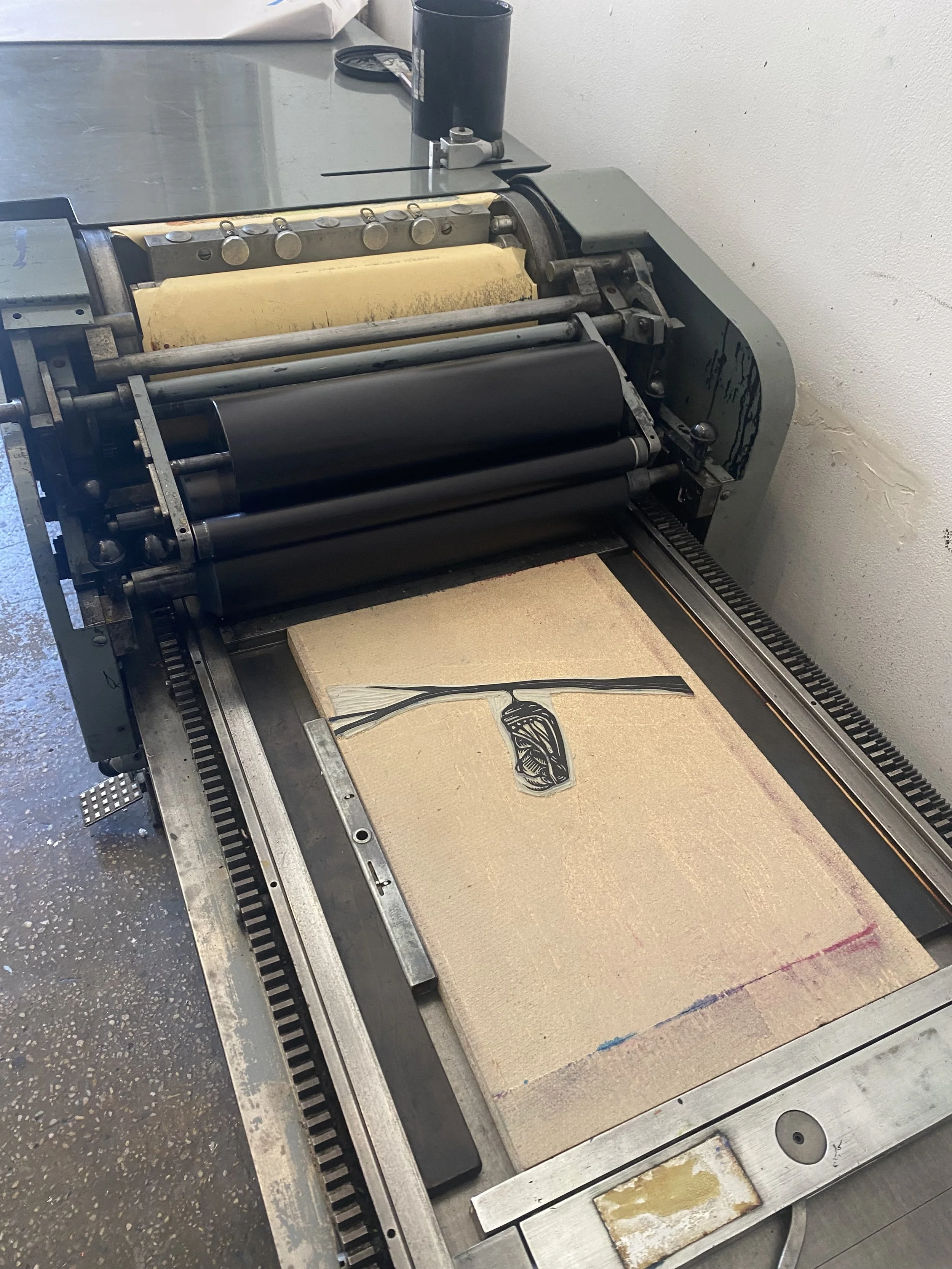
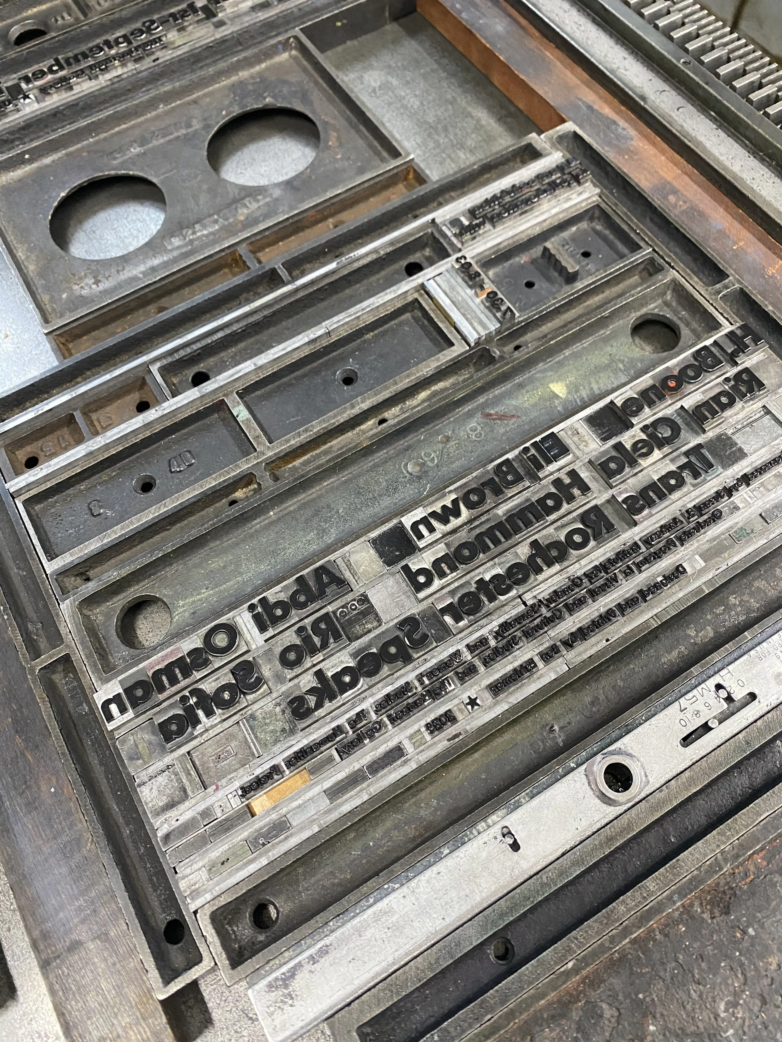

I couldn’t believe how well they turned out. 150 posters, two layers of linocut illustration, plus two layers of type, all printed on three different Vandercook presses in two different community studios. My confidence soared. I could align so many layers, I could troubleshoot different presses, and I could set all that type. I could make posters that were damn near perfect.
I editioned 150 posters, packed them securely in a box, and dropped them off at UPS for overnight shipping to the client.
And then...
...they disappeared.
Whenever I ship deliverables to a client, I check the tracking page obsessively, watching the package make its way through the system to their doorstep. This time, I refreshed the tracking page every few hours, but the package never moved.
The estimated delivery date ticked backwards day after day until finally, two days before the conference, UPS announced the package was officially lost.
All those posters. Lost.
I was devastated.
You know the five stages of grief? Pretty sure I went through them all in about a day, and then just got stuck in the depression phase. It’s so hard to make a living as a printmaker, and sometimes it feels like all the highs just get obliterated by all the lows. This project had been the highest high, followed swiftly by the lowest low.
Maybe this was a sign from the universe to just give up.
I had planned to attend the conference, and those plans were still in motion. So despite how bummed out and despondent I was feeling, I got on a train up to Rochester. When I got there, I stayed with some friends and we stayed up late catching up and talking, and they helped me remember something
Being an artist is learning to let go.
In fact, that’s kind of the whole gig. You put a ton of time and energy into making something that you absolutely love, and then you give it to a friend or you sell it at a market or you send to the client.
(Or UPS throws it off the truck into the East River.)
But in any case, you make stuff, you let it go, and then you keep on making more. That’s just what we do.
And eventually, I was able to let this go. I realized that the skills I had developed didn’t get lost in the mail. I can make 150 posters again. I can align all the layers, and troubleshoot all the presses, and set all the type. Everything I had accomplished with this project is still here at my fingertips. I can make damn near perfect posters again and again.
But, just to clarify, it did really, really, REALLY suck.
If you’re wondering how this all resolved for the client, well, it wasn’t great, but it was fine.
I had some extra posters (always print more than you need) and I brought them to the conference. We scanned them, and the conference organizers had posters digitally printed to give to conference attendees. The keynote speakers got the few remaining original posters. It wasn’t the ideal, but it was something.
Eventually UPS found the posters in Kansas City and sent them on their merry way to Rochester. The client received the posters, albeit about three weeks after the conference was over.
Those posters are still the best I’ve ever made. This project was still the highest high, followed by the lowest low. And it was a great reminder to let it go, and to just keep making more.
Want me to make damn near perfect posters for you?